

Dashboard
Analytics Dashboard
The Analytics Dashboard provides a centralized view of notification performance, delivery health, resource utilization, and operational trends across all communication channels.
It enables teams to monitor messaging activity, investigate anomalies, evaluate provider performance, and analyze notification delivery at both global and event-specific levels.
Use the Analytics Dashboard to:
- Monitor notification volumes entering and leaving the system.
- Track delivery performance across channels.
- Identify operational bottlenecks and anomalies.
- Analyze user engagement metrics.
- Optimize provider routing strategies.
- Investigate event-level delivery issues.
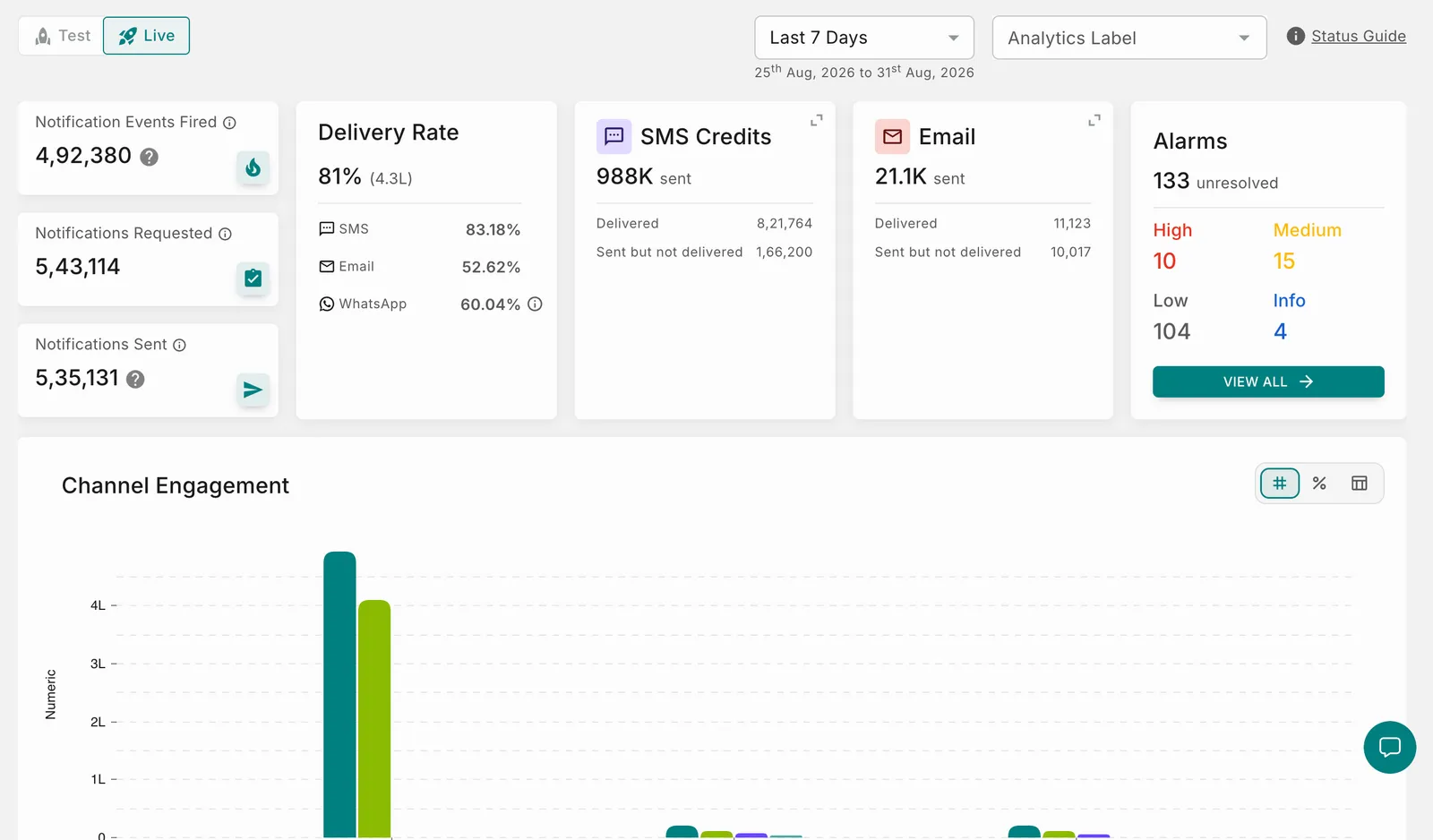
NOTE: All metrics displayed throughout the dashboard are affected by the selected Environment, Analytics Label, and Time Frame filters.
Global Controls
The controls at the top of the dashboard determine the scope of data displayed across all widgets.
Top Bar Controls
Environment Toggle
Choose the environment you want to analyze.
Analytics Labels
Analytics Labels allow teams to isolate performance metrics associated with a particular business function, application, or campaign.
Applying an Analytics Label updates every dashboard widget to display only the data relevant to the selected label.
A time filter, allowing you to toggle between the below-mentioned options helps you narrow down the timestamp for the dashboard.
The following reporting periods are supported:
- Today
- Yesterday
- Last 60 Minutes
- Last 7 Days
- Last 28 Days
- Custom Date Range
Use shorter date ranges while troubleshooting and longer periods when analyzing trends.
Key Performance Indicators (KPIs)
The KPI cards provide a high-level summary of notification volumes flowing through the platform.
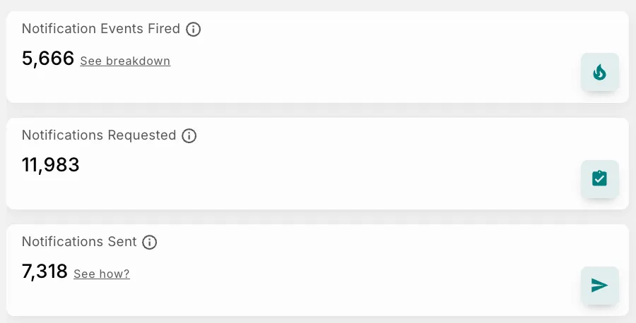 These metrics help you understand how notifications progress through the system—from the time an event is triggered until notifications are delivered to recipients.
KPI Definitions
Notification Breakdown
Notification Events can have the following outcomes:
- Event Fired
- Event Dropped (Dropped across all channels)
- Event Delivered (Delivered on at least one channel)
- Event Undelivered (Not delivered on any channel)
Delivery %
Notifications Requested
Represents the total number of notification requests received by Fyno for processing during the selected reporting period.
A single event may generate multiple notification requests if multiple recipients or channels are configured.
Notifications Sent
Represents notifications successfully handed off to configured providers.
Select See how to understand how this value is calculated.
Calculation
The Sent count is derived by subtracting notifications in the Error, Failed, Dropped, and Timeout states from the total Requested notifications.
Delivery Rate
The Delivery Rate card provides visibility into overall delivery performance across all communication channels.
It represents the percentage of attempted notifications that were successfully delivered.
Delivery Rate Metrics
SMS Credits Used
The SMS Credits card tracks SMS credit utilization across configured providers.
Use this widget to:
- Monitor SMS usage trends.
- Estimate future credit requirements.
- Identify unexpected increases in SMS consumption.
- Analyze provider-specific usage patterns.
Monitor SMS credits proactively to prevent delivery failures caused by insufficient provider balances.
Alarms
The Alarms card highlights operational issues that may impact notification processing or delivery performance.
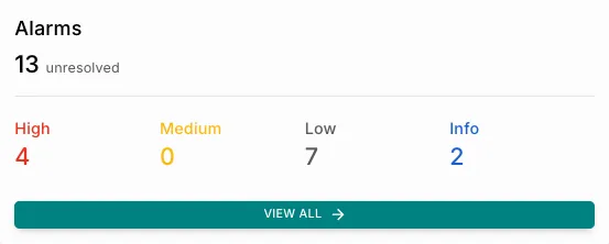 Use this section to quickly identify and prioritize issues requiring investigation.
Alarm Severity Levels
Select View All to investigate alarms in greater detail.
Anomalies
The dashboard automatically detects and surfaces traffic anomalies.
 Examples include:
- Sudden spikes in notification volume
- Significant deviations from historical traffic
- Unexpected provider behavior
Select View Details to review the complete anomaly information.
Review anomalies promptly to identify operational issues before they affect end users.
Channel Engagement
The Channel Engagement section provides a detailed view of notification activity across each communication channel and the outcomes associated with those notifications.
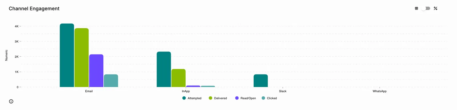 Use this visualization to understand how recipients interact with notifications after they have been delivered.
The available engagement metrics include:
- Attempted
- Delivered
- Read/Open
- Clicked
Engagement Metrics
Attempted
Represents the total number of notification requests that Fyno attempted to send to the configured providers.
An attempted notification has successfully passed Fyno’s internal validation and processing stages and has been handed off to the provider for delivery.
Calculation
Delivered
A notification is considered Delivered when it has successfully reached its intended destination and the provider confirms successful delivery. Examples of destinations include:
- Mobile numbers
- Email addresses
- Push notification device tokens
Delivery Rate
Read / Open
These metrics indicate that recipients have viewed the notification.
For WhatsApp and In-App notifications, providers return a Read status after recipients open the notification.
For Email notifications, Fyno tracks this interaction as Open.
Clicked
The Clicked metric represents recipients interacting with links or actionable elements contained within a notification.
Click tracking is supported for channels such as:
- In-App Notifications
- Push Notifications
- Other supported channels with click tracking
Chart Controls
You can customize the visualization to focus on specific engagement metrics.
Highlight Individual Statuses
Select a status in the chart legend to display only that metric.
Click the remaining legend items to hide or show them as required.
Toggle Display Mode
You can switch between:
- Use Count View when analyzing notification volume.
- Use Percentage View when comparing engagement effectiveness across channels.
Channel-wise / Provider Breakdown
View the breakdown of notification volume by channel and provider, so you can see how many notifications were sent, how many were delivered, and what they cost you in chargeable terms.
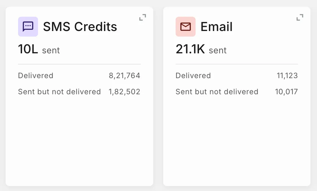 Each channel is displayed as a separate card. The metrics respect the Time Range and Live/Test filters applied at the top of the Dashboard.
Supported Channels
Select the expand icon in the top-right corner of any card to open the detailed view for that channel. The expanded view groups results by provider, with a separate table under each provider heading, and always shows exact counts rather than the abbreviated figures on the card.
The WhatsApp card shows the total number of messages delivered in the selected period, split by conversation category.
Category counts add up to the total delivered count shown at the top of the card. Hover over the info icon beside Delivered or Not billable for details on how each count is calculated.
WhatsApp is currently in Beta.
Expanded View: WhatsApp Messages Delivered
Results are grouped by provider, and each row shows delivered counts for one WABA ID and destination country.
Message counts by category (Marketing, Authentication, and Utility) are available only for Infobip, Meta, Meta Direct, and Meta Direct Plus. Messages sent through other providers still appear in the card total but are not split by category.
SMS
The SMS card reports volume in credits rather than message count, since a single SMS may consume multiple credits depending on message length and encoding.
Expanded View: SMS Credits
Results are grouped by provider, and each row shows credit consumption for one integration and destination country.
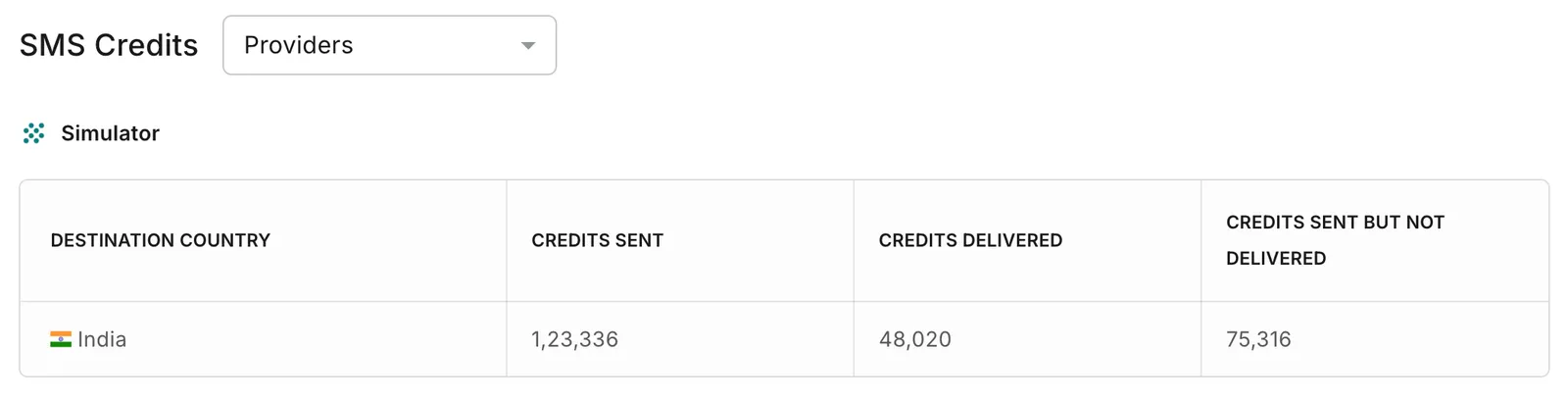
Sent equals Delivered plus Sent but not delivered for each row, and the rows add up to the totals shown on the card.
The Email card shows the total number of emails sent in the selected period, along with delivery outcomes.
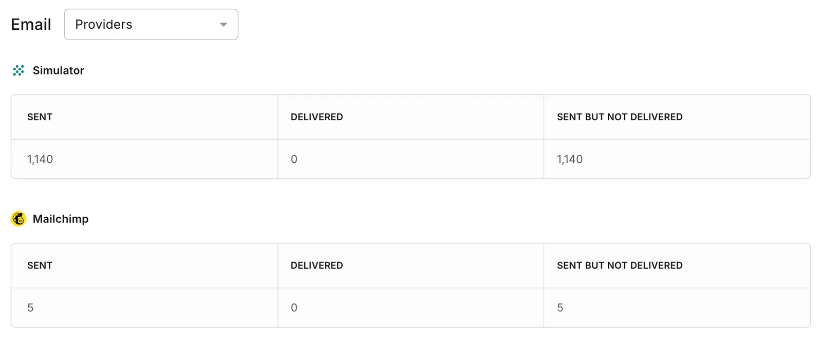
Large values are abbreviated on the headline metric (for example, 60K or 5L), while the breakdown rows always show exact counts.
Expanded View: Email
Results are grouped by provider, and each row shows volume for one integration.
Unlike WhatsApp and SMS, the Email view is not split by destination country.
Delivery Status
The Delivery Status chart displays delivery outcomes for the communication channel selected from the channel selector in the upper-right corner of the widget.
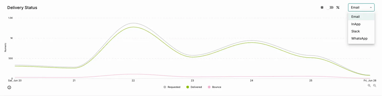 Use this visualization to monitor delivery performance and identify trends over time.
Available Statuses
Customize the Graph
You can focus on specific delivery outcomes by selecting or deselecting statuses from the chart legend.
This helps isolate individual delivery metrics and simplify analysis.
Use the Delivery Status Chart to
- Identify delivery fluctuations.
- Detect sudden increases in undelivered notifications.
- Monitor changes in notification demand.
- Analyze channel-specific delivery performance.
- Identify delivery challenges affecting individual communication channels.
Use the Channel selector to compare delivery performance across different communication channels and identify long-term delivery trends.
Provider Performance
The Provider Performance section compares notification performance across all configured providers. It helps you evaluate provider reliability, measure recipient engagement, and optimize notification routing strategies.
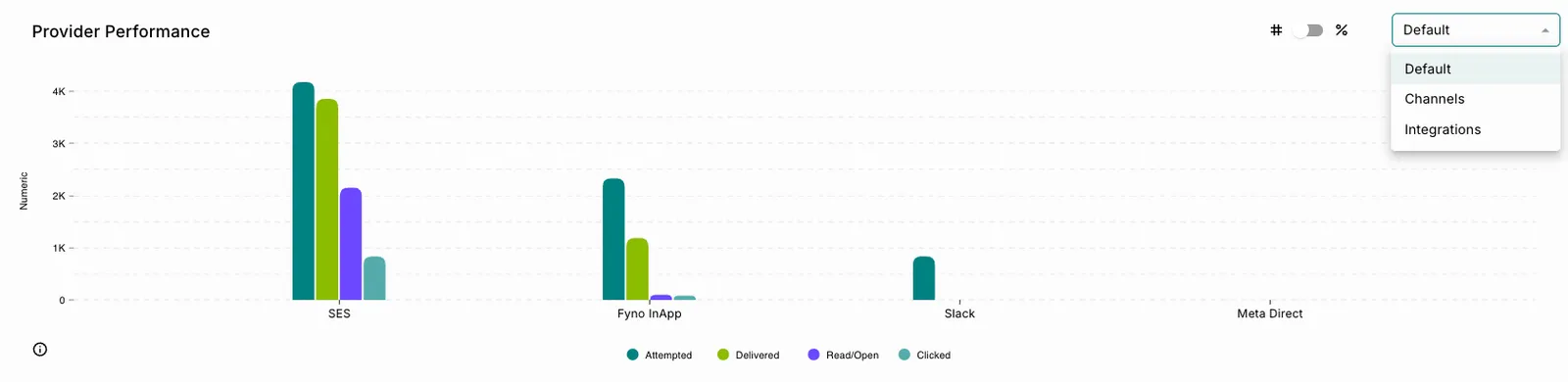 By monitoring provider performance regularly, you can identify underperforming providers, compare delivery outcomes, and make informed routing decisions to improve overall notification success rates.
Performance Indicators
The Provider Performance matrix displays the following metrics for each provider.
Attempted
An attempted notification has successfully passed Fyno’s validation and processing stages and has been handed off to the provider for delivery.
Calculation
Delivered
A notification is considered Delivered once it reaches its intended destination and the provider confirms successful delivery.
Examples of destinations include:
- Mobile numbers
- Email addresses
- Push notification device tokens
Delivery Rate
Read / Open
These metrics indicate that recipients have viewed the notification.
Clicked
The Clicked metric tracks recipient interactions with links or actionable elements contained within notifications.
This metric is available for supported channels such as:
- In-App Notifications
- Push Notifications
- Other supported channels with click tracking
Use Provider Performance to
- Identify underperforming providers.
- Compare provider effectiveness.
- Optimize notification routing strategies.
- Improve overall notification delivery success rates.
Delivery Rates
The Delivery Rates table provides detailed delivery metrics for your notification workflows.
Using the grouping selector, you can view delivery performance based on: 
- Notification Events
- Analytics Labels
You can also select Expand View to analyze notification metrics in greater detail.
Grouping Options
Notification Events
By default, delivery metrics are grouped by Notification Events, allowing you to analyze individual notification workflows.
Use this view to:
- Analyze specific notification journeys.
- Investigate workflow-level delivery issues.
- Compare notification event performance.
- Troubleshoot individual workflows.
Analytics Labels
Selecting Analytics Labels groups notification data using labels assigned to notification events.
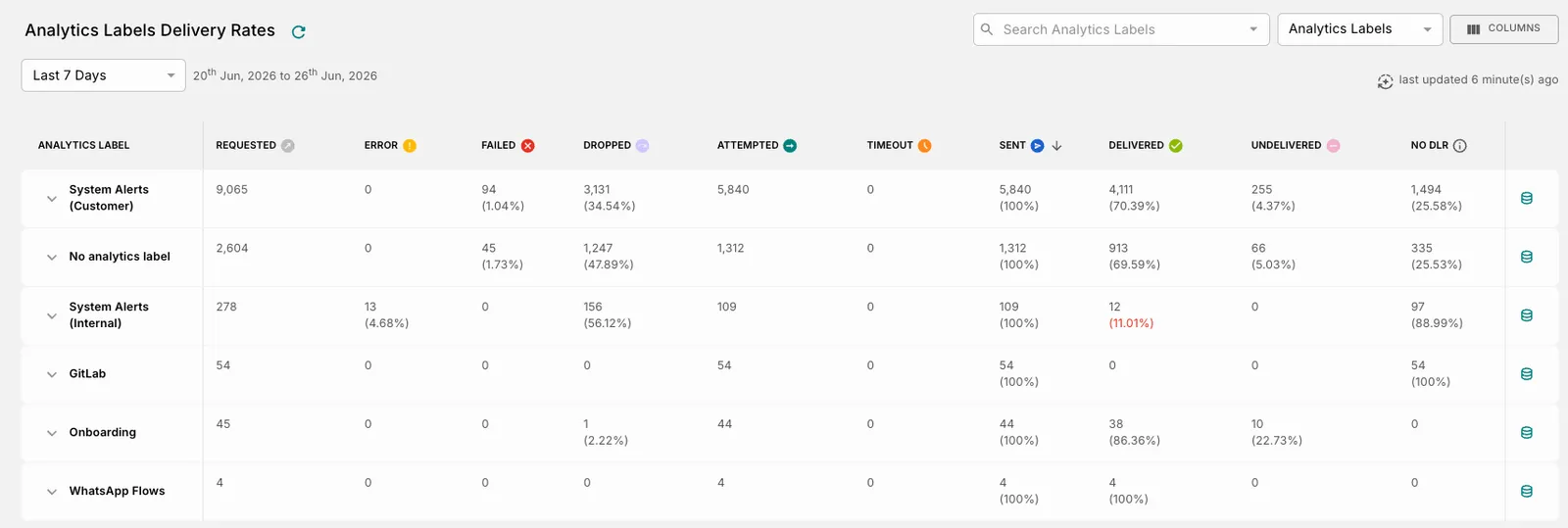 Use this view to:
- Analyze campaign-level performance.
- Consolidate reporting across multiple workflows.
- Compare business initiatives.
- Evaluate label-based notification segments.
Search Notification Events
Use the Search Notification Events field to quickly locate one or more notification events or analytics labels.
Selecting one or multiple values filters the table to display only the relevant data.
Use the Delivery Rates Table to
- Analyze notification event performance.
- Compare delivery outcomes across campaigns.
- Identify delivery bottlenecks.
- Troubleshoot workflows experiencing high failure rates.
- Evaluate performance using Analytics Labels.
Notification Event Delivery Rates (Expanded View)
Select Expand View to access a detailed breakdown of a notification event or analytics label.
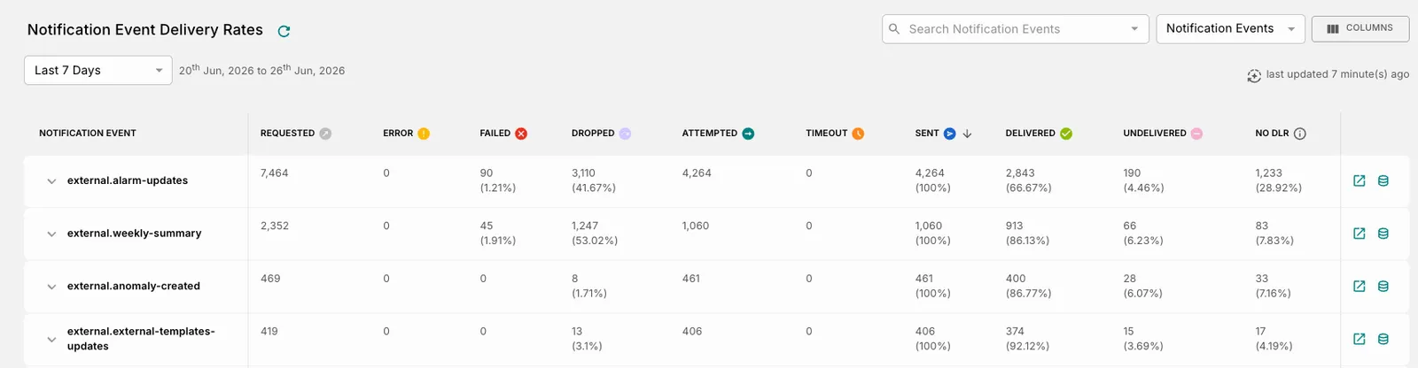 The expanded view provides additional visibility into the notification lifecycle, making it easier to investigate delivery patterns, identify bottlenecks, and troubleshoot workflow-specific issues.
Use this view when you want to:
- Understand where notifications exit the delivery funnel.
- Investigate high failure rates.
- Analyze delivery performance at a granular level.
- Compare outcomes across different notification stages.
- Accelerate root cause analysis.
Expanded View Controls
Workspace Controls
Status Definitions
The Notification Event Delivery Rates table tracks notifications as they progress through different stages of the delivery lifecycle.
Understanding these statuses helps you identify where notifications are successfully progressing and where intervention may be required.
Status Definitions
Percentage Calculations
When viewing the table in Percentage (%) mode, each status is calculated using the following denominator.
Hourly Notification Volume
The Hourly Notification Volume chart displays notification traffic throughout the selected reporting period.  Use this visualization to identify when notification activity is highest and detect periods of unusually high or low messaging volume.
Use this view to
- Identify peak notification hours.
- Understand user engagement patterns.
- Optimize notification scheduling strategies.
- Allocate operational resources effectively.
- Detect unexpected traffic spikes or drops.
- Validate campaign execution timings.
Provider Latency
The Provider Latency report measures how quickly providers acknowledge notification requests and how long notifications take to reach recipients.  This report helps you identify provider-related delays, compare provider responsiveness, and troubleshoot delivery bottlenecks.
Why Use Provider Latency?
Use this report to:
- Monitor delivery speed across providers.
- Compare provider responsiveness.
- Identify delays in provider acknowledgments.
- Analyze latency trends for specific providers.
- Troubleshoot provider-related delivery issues.
- Optimize provider routing decisions.
Understanding the Chart
Each configured provider is displayed on the X-axis, while the Y-axis represents the number of notifications.
For every provider, the chart compares:
- Total notifications attempted
- Delivery latency
- Provider response latency
This enables you to evaluate both:
- Provider responsiveness (acknowledgment time)
- Actual delivery performance (delivery time)
Metrics
Example
Suppose the report displays the following metrics for Amazon SES.
This indicates that:
- Most notifications were delivered in less than one second.
- A smaller number experienced delivery delays.
- Provider acknowledgments were received across multiple latency ranges.
- Overall, the provider demonstrates strong delivery performance with some variation in response times.
Filter Providers
Use the Provider filter in the upper-right corner of the report to:
- View latency data for a specific provider.
- Compare latency metrics across providers.
- Focus troubleshooting efforts on a single provider or communication channel.
Activity Trends
The Activity Trends report helps you understand notification activity over time by visualizing usage across different dimensions of your notification ecosystem. Use this report to monitor adoption patterns, identify changes in messaging behavior, and investigate unexpected shifts in notification activity.
Available Dimensions
Use this report to
- Identify unusually high or low usage trends.
- Understand notification adoption patterns.
- Monitor notification activity across the organization.
- Investigate unexpected changes in messaging behavior.
- Compare activity across channels or integrations.
Workflow Actions Chart
The Workflow Actions chart provides a visual representation of the number of workflow actions executed over a selected time period. It helps monitor workflow activity, identify usage trends, and analyze changes in automation volume.
Chart Components
How to Use
- Open the Workflow Actions chart from the Analytics dashboard.
- Review the trend line to understand workflow execution patterns over the selected reporting period.
- Use the # / % toggle in the upper-right corner to change the chart view:
- # – Displays the actual number of workflow actions.
- % – Displays workflow actions as a percentage.
- Hover over a data point (if supported) to view the exact value for that interval.
Example
In the example shown:
- Workflow actions begin at approximately 80.
- Activity increases sharply, reaching a peak of around 350 actions.
- After the peak, workflow executions gradually decline over subsequent intervals until they approach 0.
This trend may indicate an initial surge in workflow activity followed by a gradual decrease in executions.
Note: The values displayed in the chart depend on the selected reporting period and the available workflow execution data.