

Central Dashboard
The Central Dashboard extends the Analytics Dashboard beyond a single workspace. Instead of opening each workspace one at a time to check how it is performing, you get one page that aggregates notification performance across all the workspaces you own.
Every metric, chart, and control works exactly as it does on the workspace Dashboard. What changes is the scope: data is rolled up across workspaces, and a workspace filter lets you narrow the view to any subset of them.
Use the Central Dashboard to:
- Monitor notification volumes across all your workspaces in one place.
- Compare delivery performance between workspaces.
- Spot a workspace that is driving unusual traffic or failing deliveries.
- Review channel and provider performance without switching workspaces.
- Investigate event-level delivery issues with workspace attribution.
All metrics displayed throughout the Central Dashboard are affected by the selected Workspace, Environment, Analytics Label, and Time Frame filters.
Availability
The Central Dashboard is available to Owners and Super Admins. Workspaces are grouped based on their owner, and each group contains workspaces owned by the same user.
For Owners, the Central Dashboard shows only groups where you are the owner of all workspaces in the group. Workspaces where you hold another role, such as Workspace Admin, aren’t included.
The View Analytics entry point appears only for eligible workspace groups and opens the Central Dashboard.
Accessing the Central Dashboard
- Open the Workspaces page. Workspaces with the same owner are grouped together under the brand name. The owner can edit the brand name as needed.
- Select View Analytics to the right of the group heading to open the Central Dashboard for all workspaces in that group.
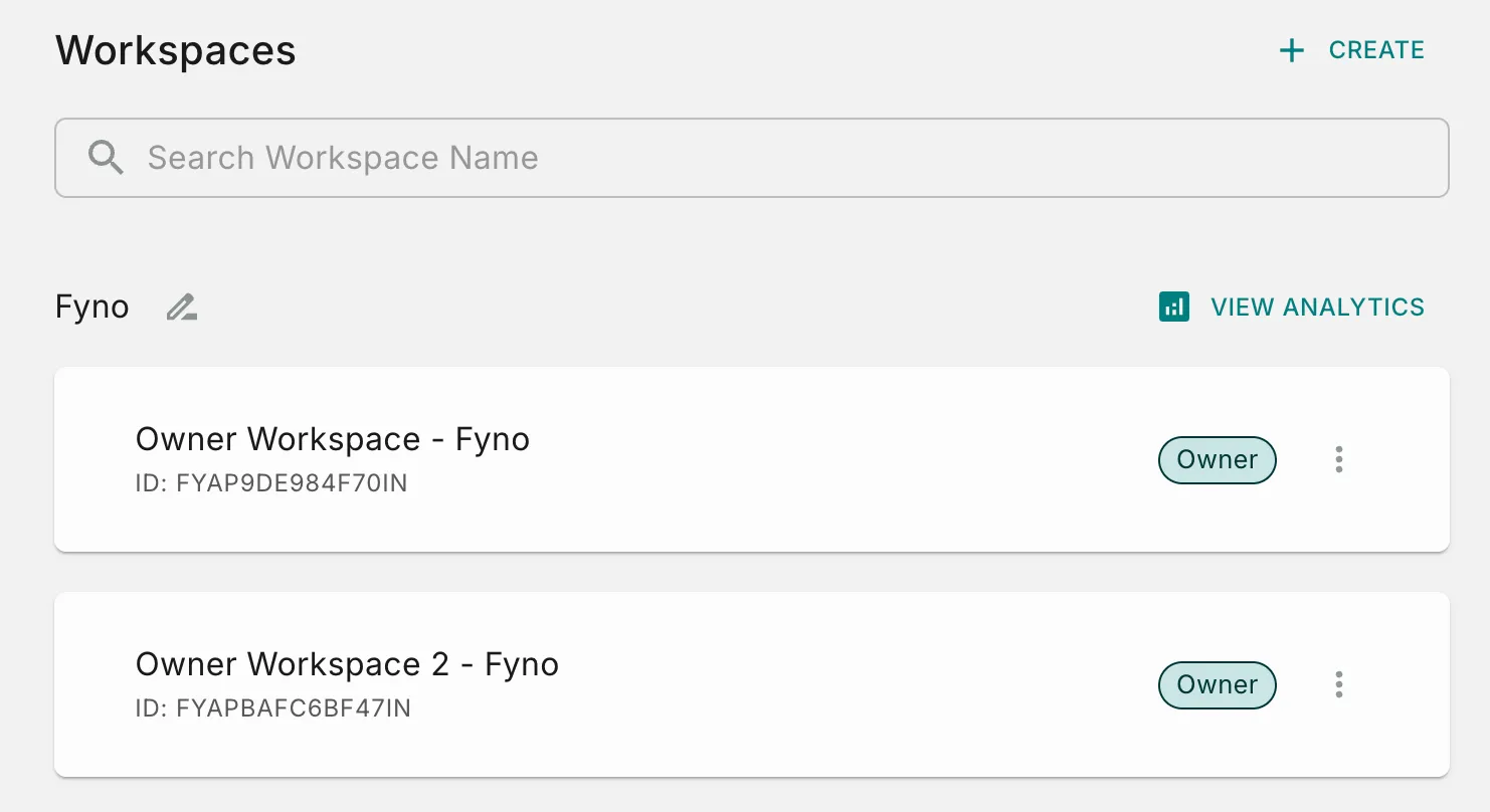
All workspaces in the group have the same owner. Owners and Super Admins can access the View Analytics option.
Global Controls
The controls at the top of the Central Dashboard determine the scope of data displayed across all widgets.
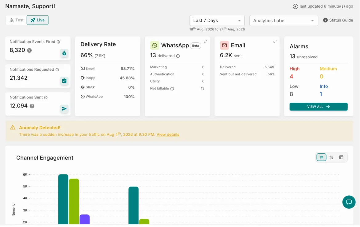
Top Bar Controls
Use shorter date ranges while troubleshooting and longer periods when analyzing trends across workspaces.
Workspace Filter
The Workspace Filter is unique to the Central Dashboard. It is a multi-select control listing every workspace you own within the group.
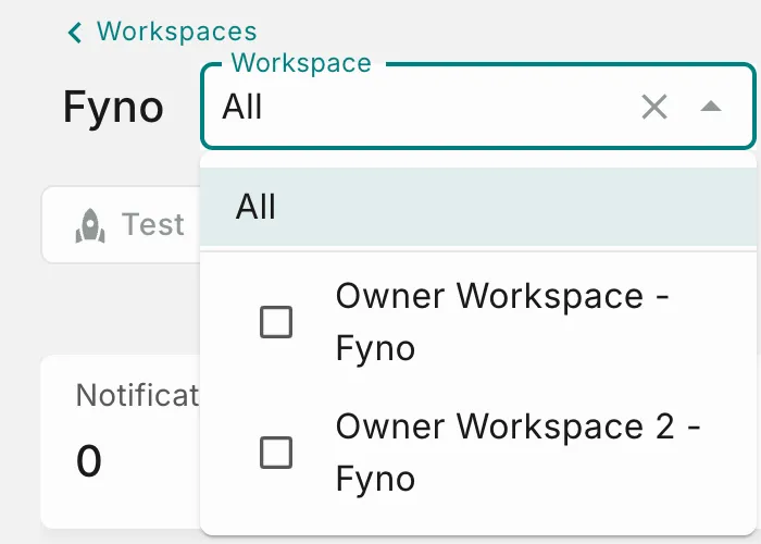 Clearing the selection returns the dashboard to All.
Start with All to spot an outlier, then select that single workspace to investigate it without leaving the page.
Key Performance Indicators (KPIs)
The KPI cards provide a high-level summary of notification volumes across the workspaces in scope.
On the Central Dashboard, each KPI is the sum across the workspaces currently in scope.
Delivery Rate
The Delivery Rate card shows the percentage of attempted notifications that were successfully delivered across the workspaces in scope, followed by a breakdown for each channel.
Channel Usage
The Central Dashboard provides channel-specific usage cards for SMS, WhatsApp, Email, and RCS. Use these cards to monitor usage, reconcile channel costs, and identify changes in consumption across the workspaces in scope. Select the expand icon on a card to view more detailed usage information.
SMS Credits
The SMS Credits card tracks SMS credit utilization across the workspaces in scope, split between delivered and sent but not delivered volume. Select the expand icon to view more detailed credit usage, including usage by integration and destination country.
Use this card to:
- Reconcile SMS credit usage and costs across workspaces.
- Review credit usage by integration and destination country.
- Monitor SMS usage trends and identify unexpected increases in consumption.
- Estimate future credit requirements.
WhatsApp Credits
The WhatsApp Credits card tracks WhatsApp credit utilization across the workspaces in scope. The expanded view provides more detailed usage information for deeper analysis and cost reconciliation.
Use this card to:
- Reconcile WhatsApp credit usage and costs across workspaces, broken down by message category (e.g., Marketing, Authentication, Utility, Service).
- Monitor WhatsApp usage trends.
- Identify unexpected changes in credit consumption.
Email Credits
The Email Credits card tracks email credit utilization across the workspaces in scope. The expanded view provides more detailed usage information for deeper analysis and cost reconciliation.
Use this card to:
- Reconcile email credit usage and costs across workspaces.
- Monitor email usage trends.
- Identify unexpected changes in credit consumption.
RCS Credits
Coming soon: The RCS Credits card will track RCS credit utilization across the workspaces in scope and provide detailed usage information for cost reconciliation and usage analysis.
Filters
The detailed (expanded) views for the SMS, WhatsApp, and Email Cost Analytics cards support additional filters, giving you more granular control over the cost data you’re analyzing.
Applying a filter updates the displayed cost analytics counts immediately, and only shows values relevant to the data available to you.
These filters apply to the SMS, WhatsApp, and Email Cost Analytics details views only, and don’t affect other analytics views on the Central Dashboard.
Notification Events Triggered By Workspace
This widget is available only on the Central Dashboard.
This widget compares notification volume across the workspaces in scope so you can see at a glance which workspace is generating the traffic.
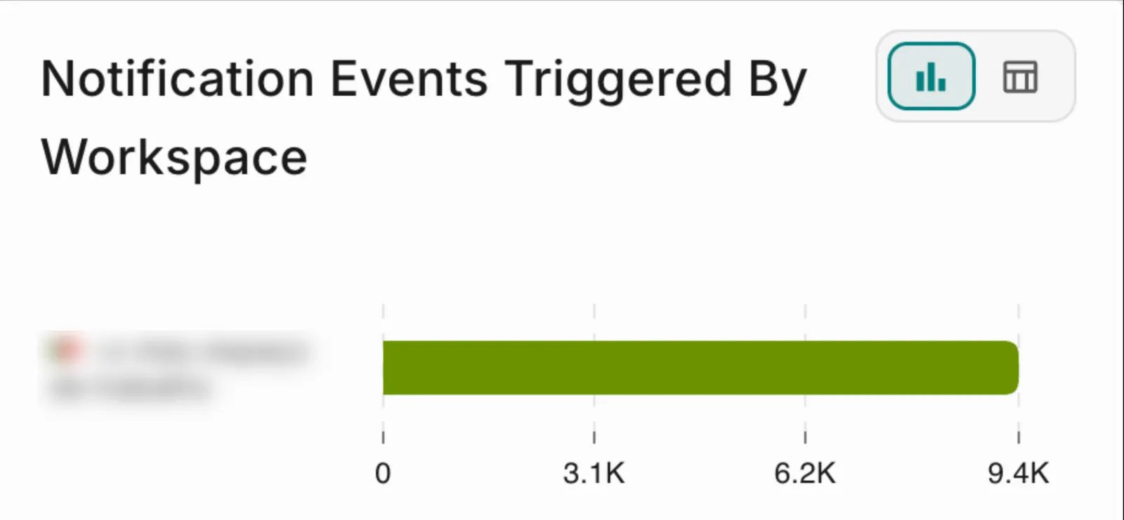 Use the toggle in the upper-right corner to switch between the chart view and the table view.
Use this widget to:
- Compare notification volumes between workspaces.
- Identify the workspace responsible for a spike in overall volume.
- Confirm that a newly configured workspace has started sending messages.
Channel Engagement
The Channel Engagement chart shows notification activity across each communication channel and the outcomes associated with those notifications, aggregated across the workspaces in scope.
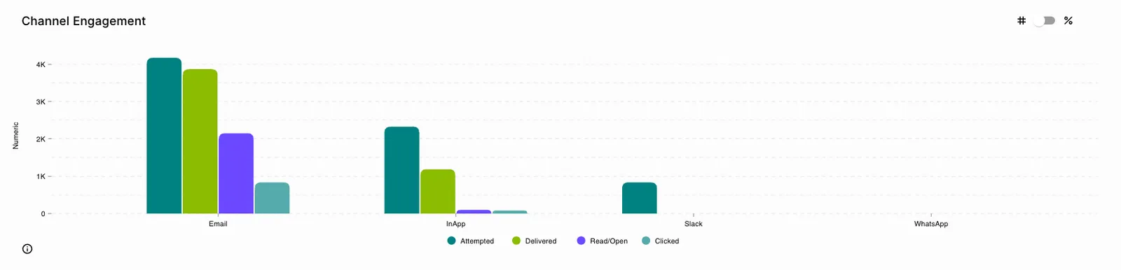 The available engagement metrics include Attempted, Delivered, Read/Open, and Clicked.
Chart Controls
Select a status in the chart legend to display only that metric, and select the remaining legend items to hide or show them as required. Use the display toggle in the upper-right corner to switch views.
Delivery Status
The Delivery Status chart displays delivery outcomes over time for the channel selected from the channel selector in the upper-right corner, aggregated across the workspaces in scope.
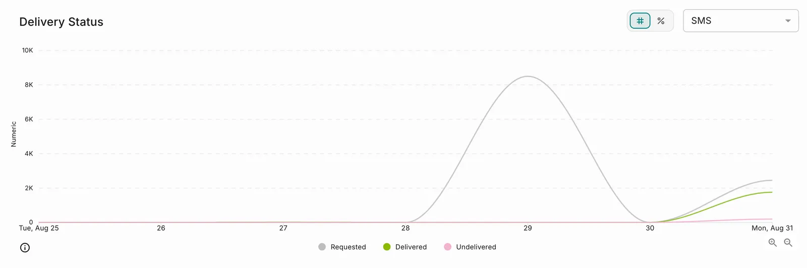 Select or deselect statuses from the legend to isolate individual delivery outcomes, and use the zoom controls in the lower-right corner to focus on a shorter span.
Use the Delivery Status chart to:
- Identify delivery fluctuations across your workspaces.
- Detect sudden increases in undelivered notifications.
- Monitor changes in notification demand.
- Analyze channel-specific delivery performance.
Provider Performance
The Provider Performance chart compares notification performance across configured providers for the workspaces in scope, helping you evaluate provider reliability and optimize routing strategies.
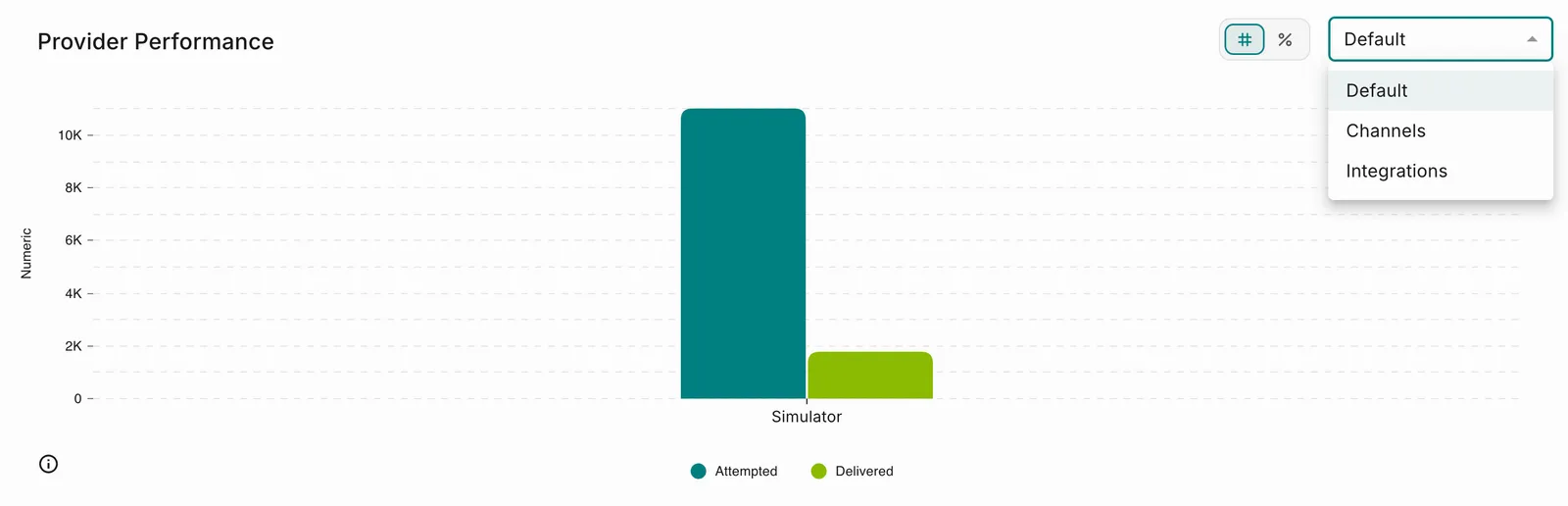
Use the selector in the upper-right corner to view provider data by channel or integration, and use the display toggle to switch between count and percentage views.
Delivery Rates
The Delivery Rates table provides detailed delivery metrics for individual notification events. Using the grouping selector, you can view delivery performance by Notification Events, Analytics Labels, or Workspaces.
On the Central Dashboard, each row also displays the workspace the notification event belongs to. Events that share a name across workspaces therefore remain distinguishable, and you can trace a low delivery rate back to the workspace it originated from.
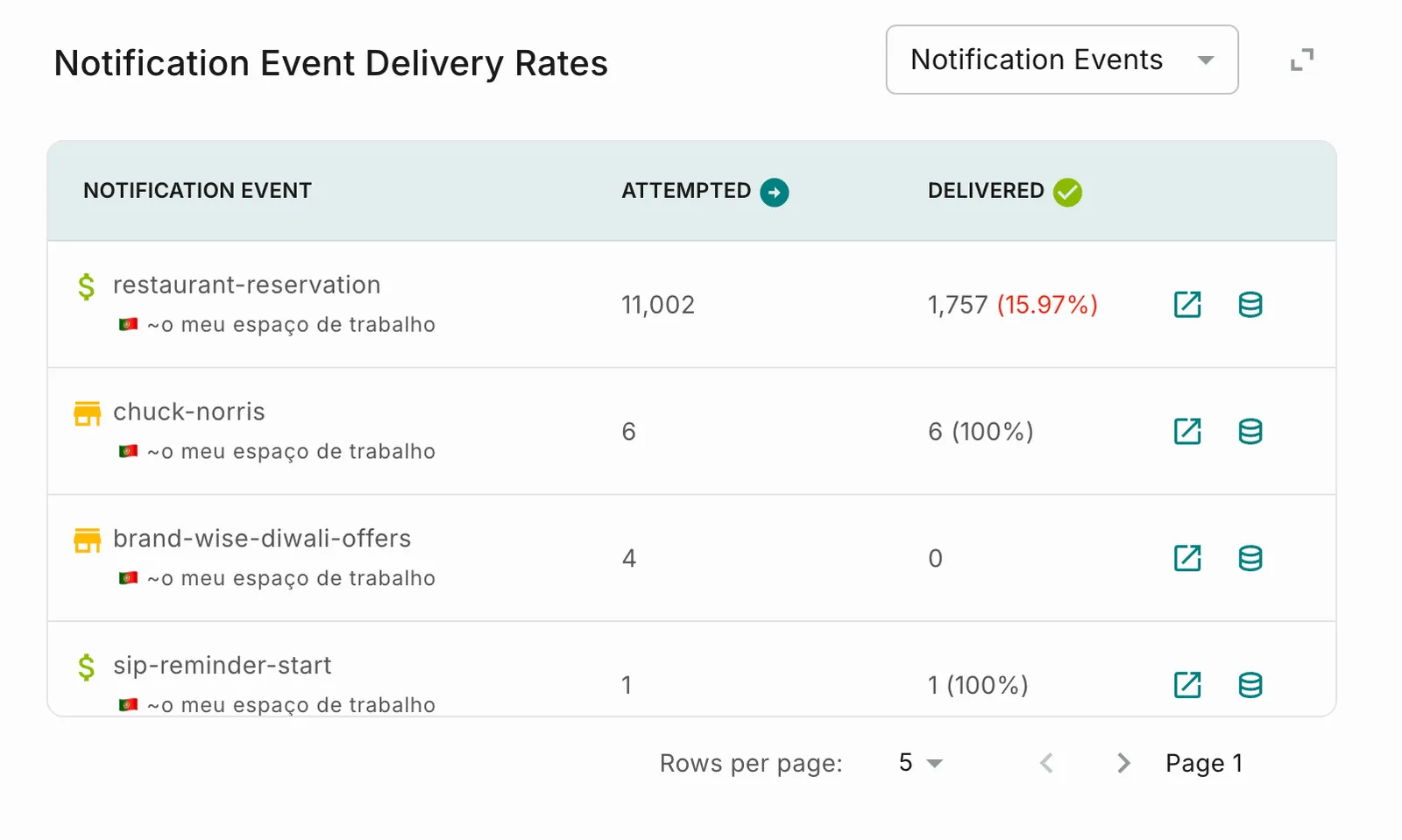 Delivery rates that fall below the expected threshold are highlighted so that problem events stand out. Select Expand View to analyze channel-wise and provider-wise metrics for a selected row.
Use the Delivery Rates table to:
- Compare notification event performance across workspaces.
- Identify delivery bottlenecks at event level.
- Troubleshoot events experiencing high failure rates.
- Evaluate performance using Analytics Labels.
Notification Event Delivery Rates (Expanded View)
Select Expand View to access a detailed breakdown of a notification event or analytics label.
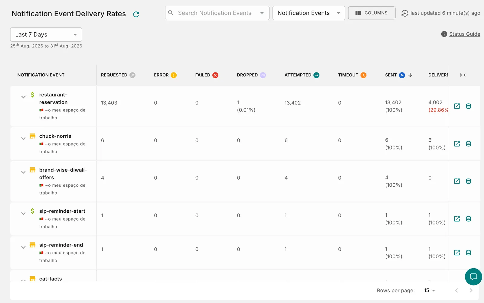 The expanded view provides additional visibility into the notification lifecycle, making it easier to investigate delivery patterns, identify bottlenecks, and troubleshoot workflow-specific issues.
Use this view when you want to:
- Understand where notifications exit the delivery funnel.
- Investigate high failure rates.
- Analyze delivery performance at a granular level.
- Compare outcomes across different notification stages.
- Accelerate root cause analysis.
Expanded View Controls
Workspace Controls
Status Definitions
The Notification Event Delivery Rates table tracks notifications as they progress through different stages of the delivery lifecycle.
Understanding these statuses helps you identify where notifications are successfully progressing and where intervention may be required.
Status Definitions
Percentage Calculations
When viewing the table in Percentage (%) mode, each status is calculated using the following denominator.
Hourly Notification Volume
The Hourly Notification Volume chart displays notification traffic throughout the selected reporting period.
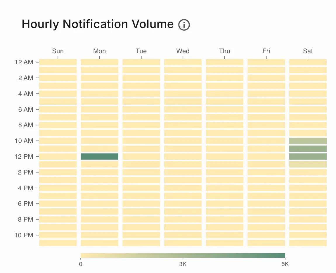 Use this visualization to identify when notification activity is highest and detect periods of unusually high or low messaging volume.
Hourly Notification Volume
The Hourly Notification Volume heatmap displays notification traffic by day of week and hour of day for the selected reporting period. Darker cells indicate higher volume, and the scale below the chart shows the range.
Use this view to:
- Identify peak notification hours across your workspaces.
- Optimize notification scheduling strategies.
- Detect unexpected traffic spikes or drops.
- Validate campaign execution timings.
Activity Trends by channel
The Activity Trends by channel report visualizes notification activity over time across the selected dimension, so you can monitor adoption patterns and investigate unexpected shifts in messaging behaviour.
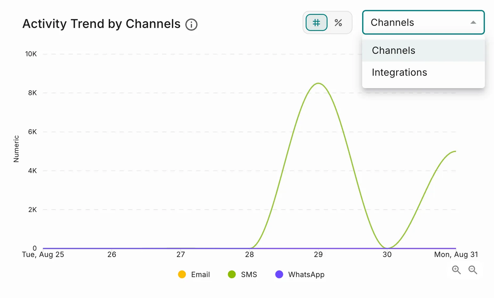
Use the display toggle to switch between count and percentage views, and the zoom controls in the lower-right corner to narrow the span.
Hover over any point in the graph to view detailed metrics for that time period.