

Real-time Dashboard
The Real-time Dashboard shows notification traffic as it happens, over a short rolling window, and refreshes itself automatically every 10 seconds. Where the Analytics Dashboard is built for reporting and trend analysis over days or weeks, the Real-time Dashboard is built for the minutes during and after a send.
The Real-time Dashboard is currently in Beta. Metrics and controls may change between releases.
Navigate to: Dashboard > Real-time. Real-time sits under Dashboard in the left menu and is not visible until you click Dashboard.
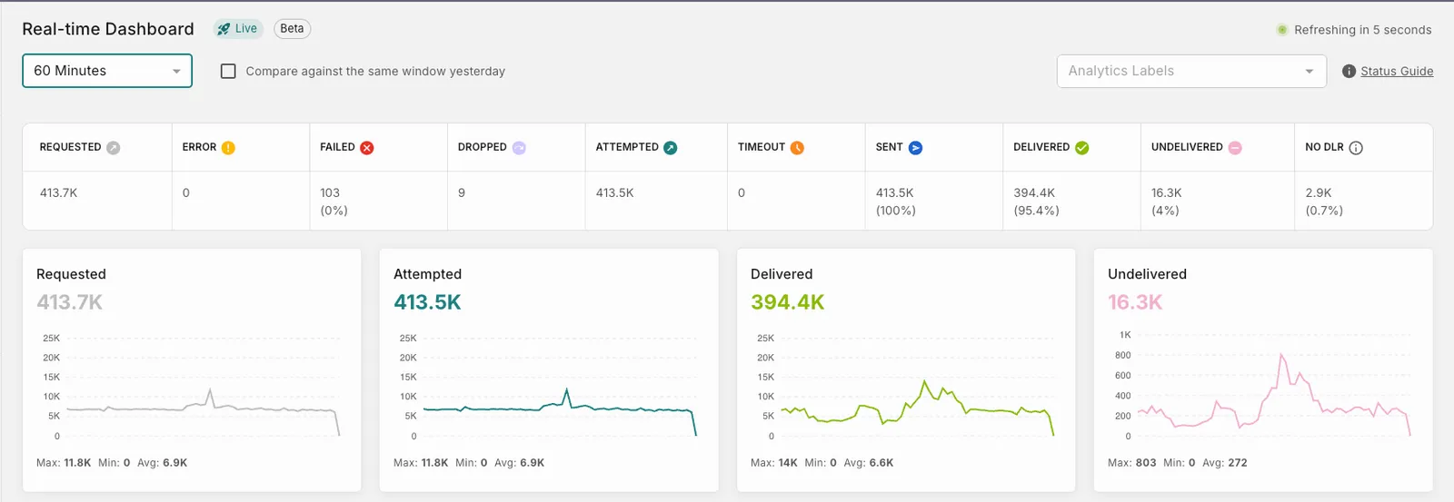
Use the Real-time Dashboard to:
- Watch a campaign or bulk send as it executes.
- Catch a spike in Error, Failed, or Undelivered while you can still act on it.
- Confirm that a route, template, or provider change behaves as expected right after you ship it.
- Verify traffic is flowing at all before escalating to a provider.
Global controls
The controls at the top of the page set the scope for every widget on it.
Status summary
The strip across the top of the page counts every notification in the selected window at each stage of its lifecycle.
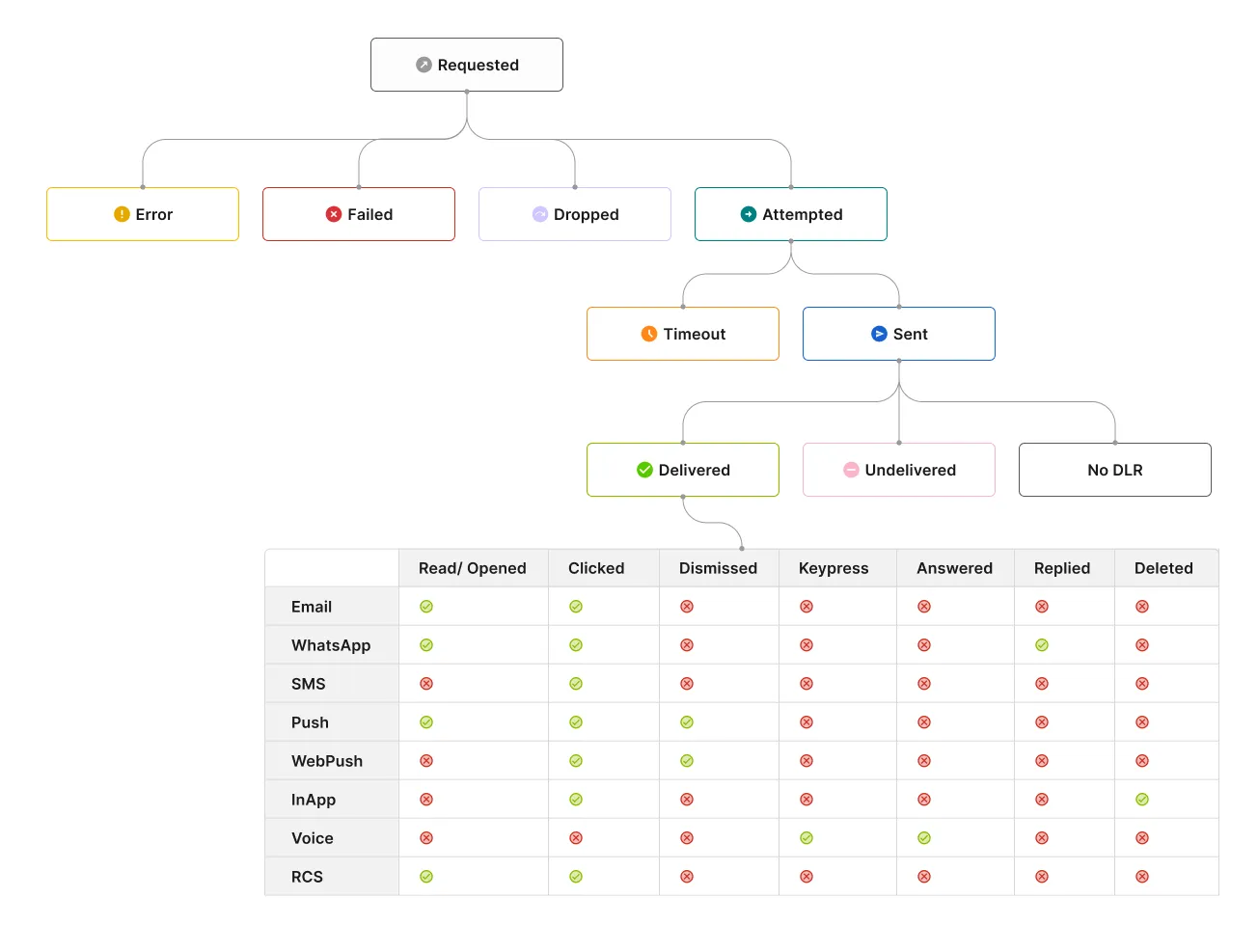
Large counts are abbreviated, so 8,900 notifications appear as 8.9K.
Alongside the count, the Sent and No DLR counters also show a percentage.
Counts are derived the same way as elsewhere in Fyno:
Delivery reports arrive after the notification is sent, not at the same time. Fyno counts a notification under Sent as soon as the provider accepts it, but cannot count it under Delivered, Undelivered, or No DLR until the provider reports back, which can take seconds or minutes. Delivered therefore reads lower than Sent for a while after a send, and on a 5- or 15-minute window it may read zero while Sent is in the thousands. This is expected. Widen the window to 60 minutes before concluding that delivery has stalled.
Trend cards

Four cards plot the shape of traffic across the window. Each card shows its total for the window, a trend line, and Max, Min, and Avg below the chart. The vertical axis scales to the data in the window.
Maximum, Minimum, and Average are the highest, lowest, and average values across the points plotted in the window.
Hovering over any point on one of the four charts shows the values at that exact time across all four cards.
Delivery rates
The table at the bottom of the page breaks delivery performance down for the same window.
Use the dropdown in the section heading to switch between:
- Notification Events Delivery Rates: grouped by individual notification events, for pinpointing which workflow is degrading.
- Analytics Labels Delivery Rates: grouped by label, for tracking a campaign or business initiative as a whole.
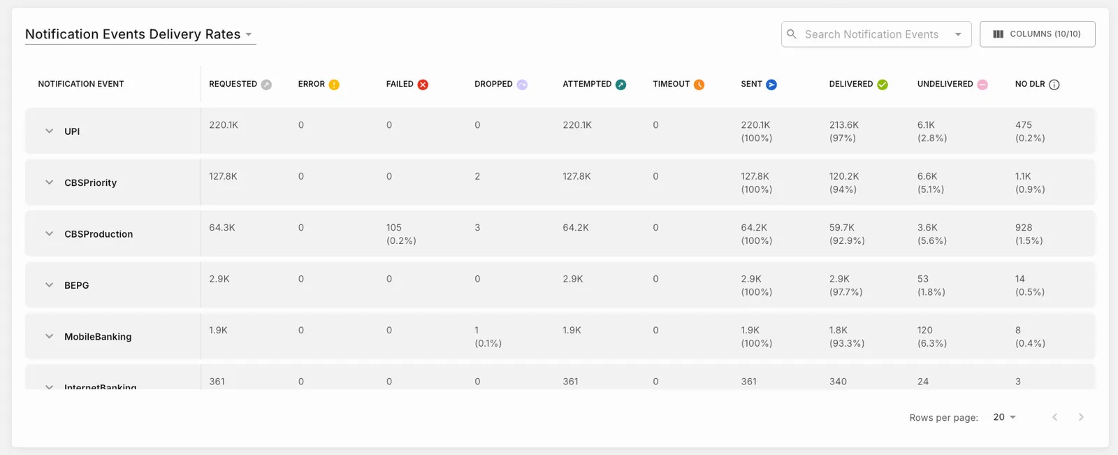
The table carries the same statuses as the status summary strip: Requested, Error, Failed, Dropped, Attempted, Timeout, Sent, Delivered, Undelivered, and No DLR.
Two controls sit above the table:
Each row can be expanded using the arrow beside its name. Expanding a notification event shows one row per integration that was used, with the channel shown beneath the integration name, and the status counts for that integration alone. A channel appears in more than one row when the notification event used more than one integration on it.
If no notifications match the current window and filters, the section shows “No data found for the selected window”. Widen the window or clear the Analytics Labels filter.
Channel trends
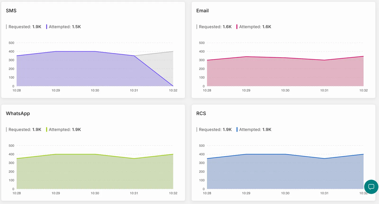
A card is shown for each channel with a notification requested for the selected time slice. Each card plots Requested and Attempted across the window as two series, with the total for each shown in the legend above the chart. The horizontal axis is marked at one-minute intervals across the selected window.
Hovering over a point on any channel’s chart shows the count for every channel at that same time.